717 Harwood Drip Campaign
Branding | Collaboration | Inbound Market Strategy
Might wonder why have a drip campaign in a portfolio, well when everything goes wrong and you go over budget and timeline you learn.
717 Harwood’s style is this funky, mid century modern vibe surrounded by downtown vibrancy. This was a 8-month process with a multitude of collaborators consisting of my marketing team, three (3) brokers leasing out the building, and the building ownership team (World Class Capital Group).

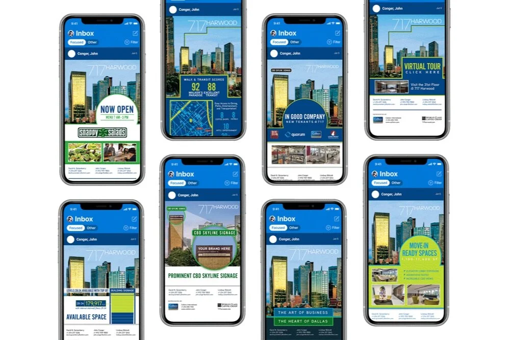
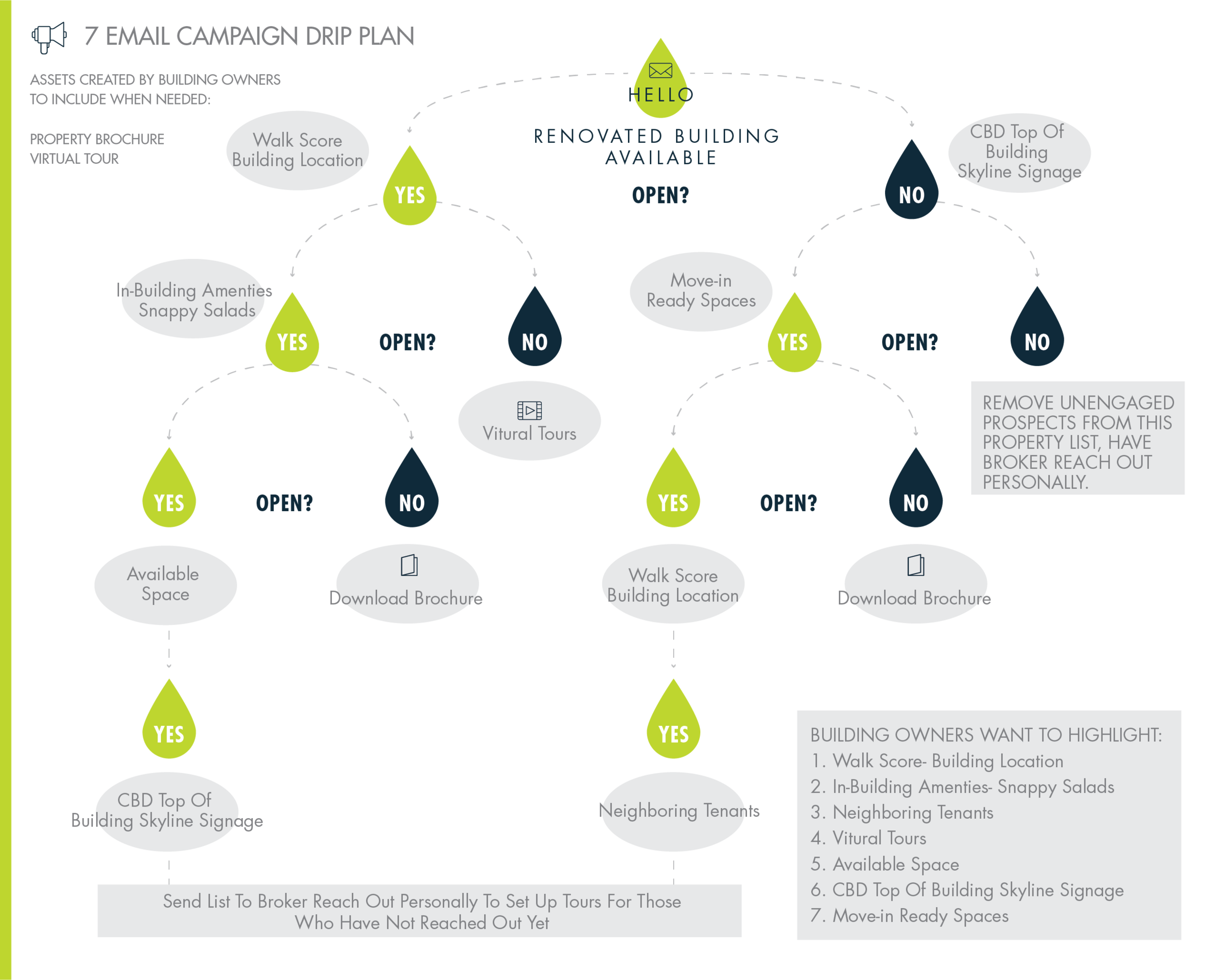
Even though a Commercial Real Estate drip email campaign can be highly effective in marketing a property, we had to be cautious to contact prospects too frequently. Building ownership agreed that a max of 5 emails would be sent to a prospect if they opted to continue receiving information about the building as shown in the plan below. We also mapped out the features highlighted for each e-blast below.
7171 Harwood has a very distinct style throughout the tenant-facing spaces. By visiting and photographing some of the elements within these spaces, we worked through a wishlist of attributes and a mood board based on the building’s voice itself.
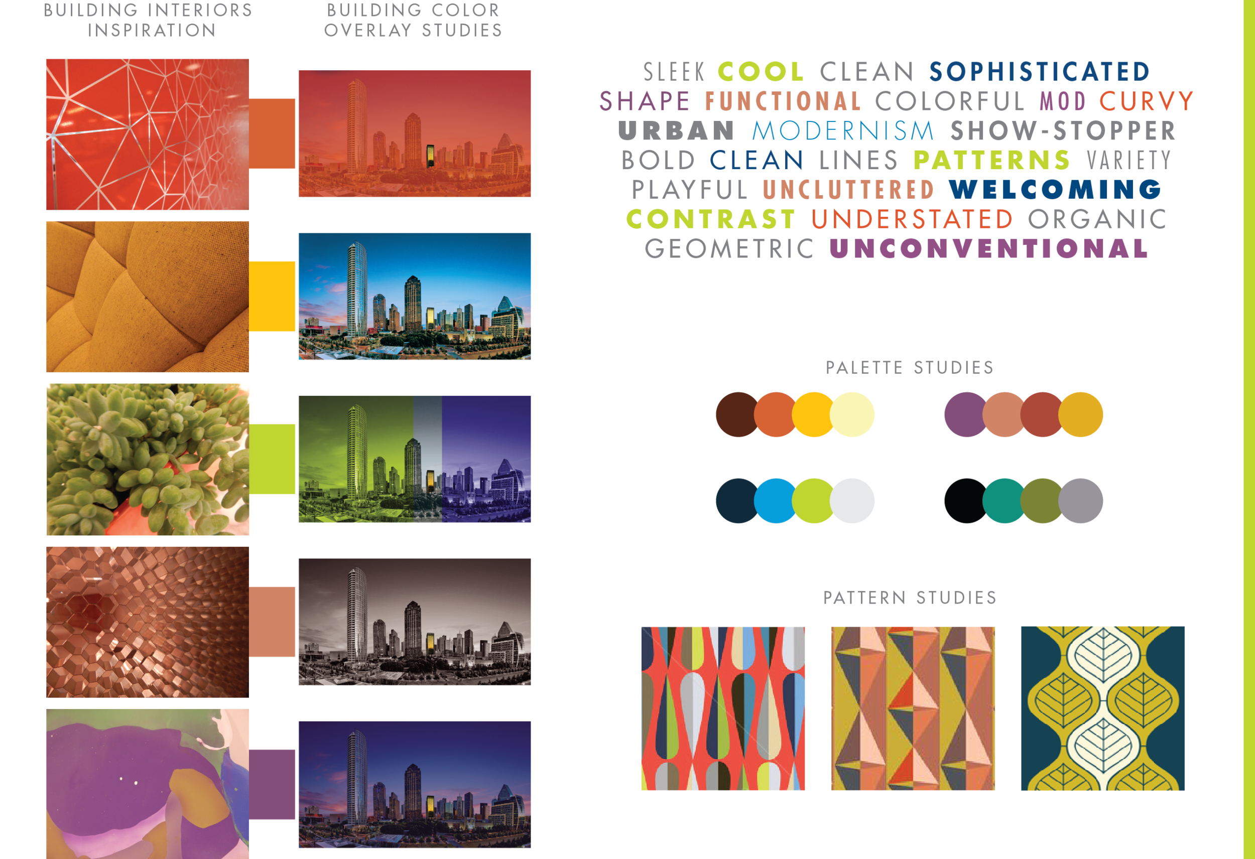
Guided by our mood boards, we iterated broadly and played with different typography, graphic elements, and shapes to ground the palette. I tested out different typefaces, patterns, graphic elements, colors, and styles. I worked closely with World Class Capital Group (Building Ownership) throughout the process to learn what was working and continued to refine. Below are a handful of our concepts.
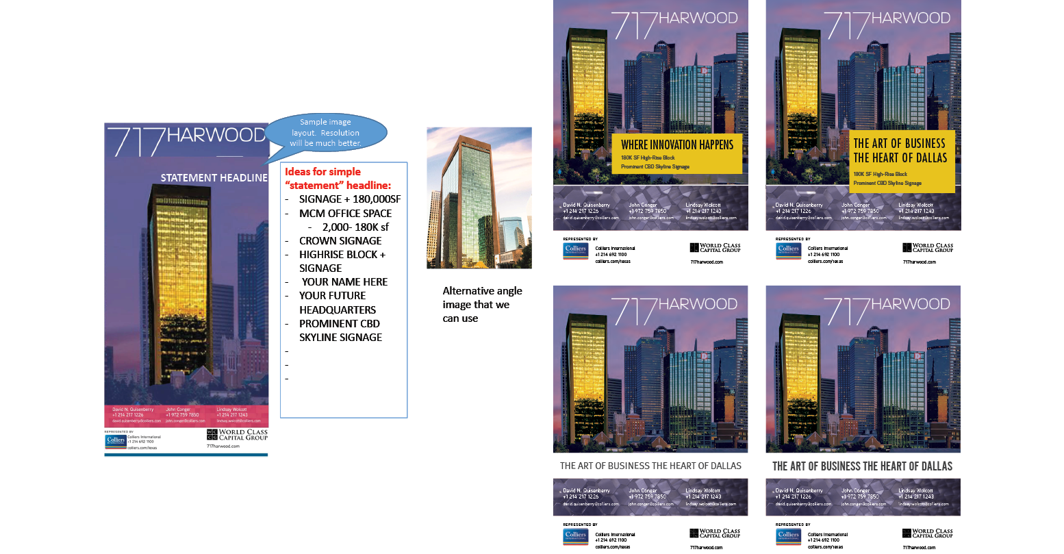
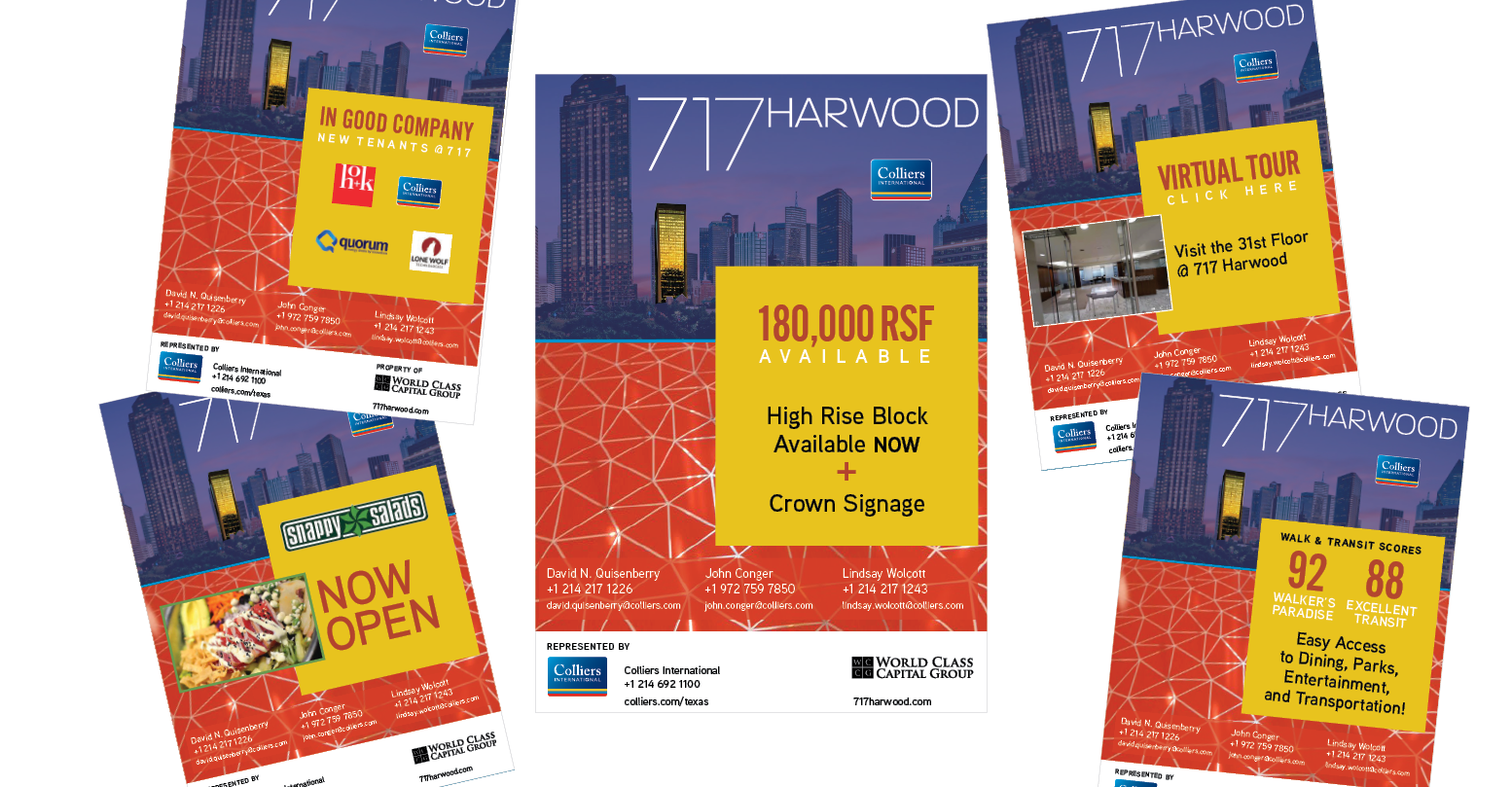
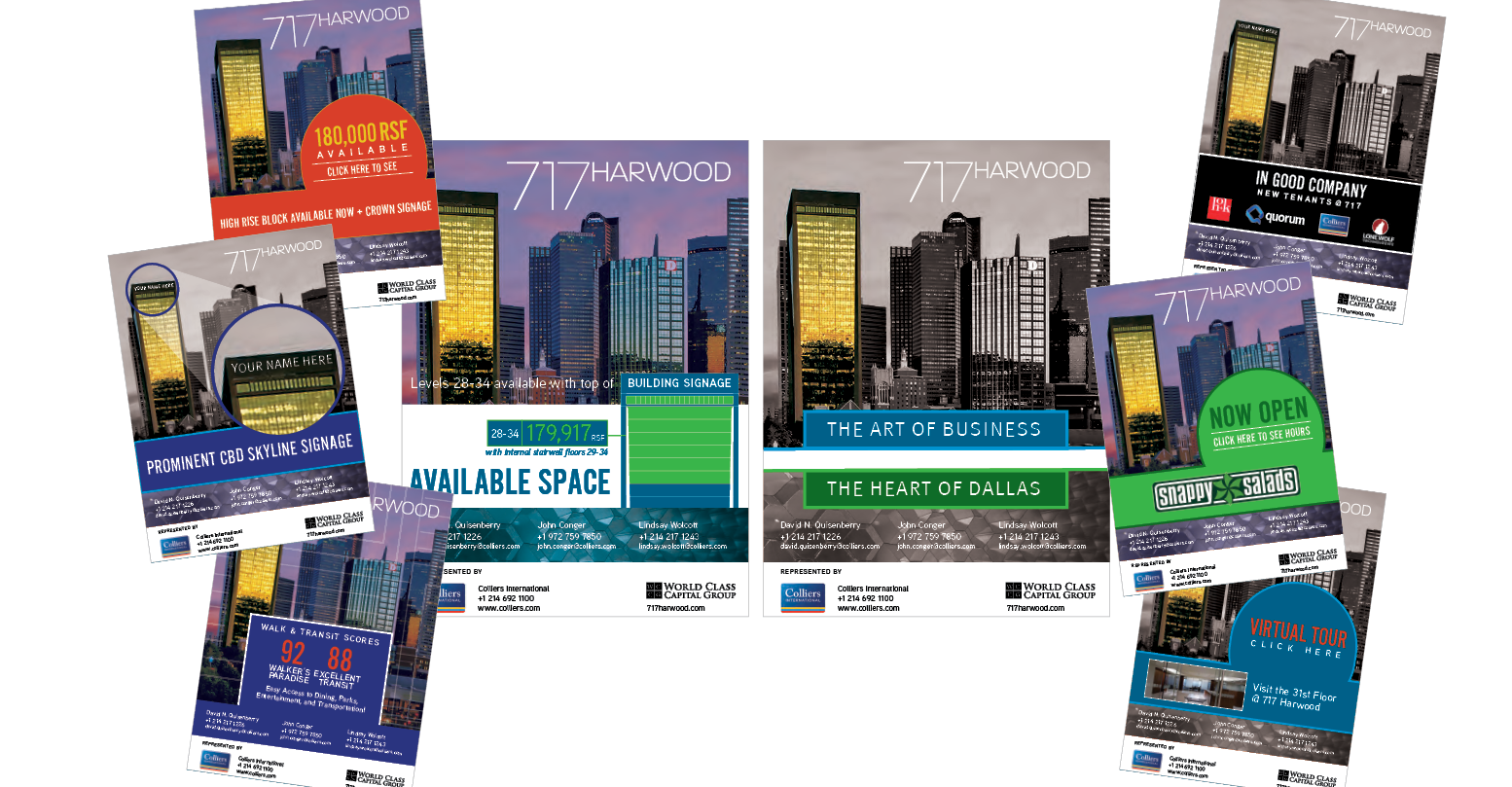
After several rounds of review and collaboration with the owners, half approved and half were not satisfied. The content was approved, but the overall look was lacking for some on their team. I asked for the weekend to revisit our research and development from the weeks before and come up with a new scheme. We all agreed the overall look worked, but the colors needed to be simplified. I pulled from the attributes below to revitalize the color palette in a different direction. The new color direction was a direct extension of the in-office visual experience- fresh and vibrant.
• Mid-Century
• Timeless
• Clean
• Youthful
• Vibrant
• Contemporary
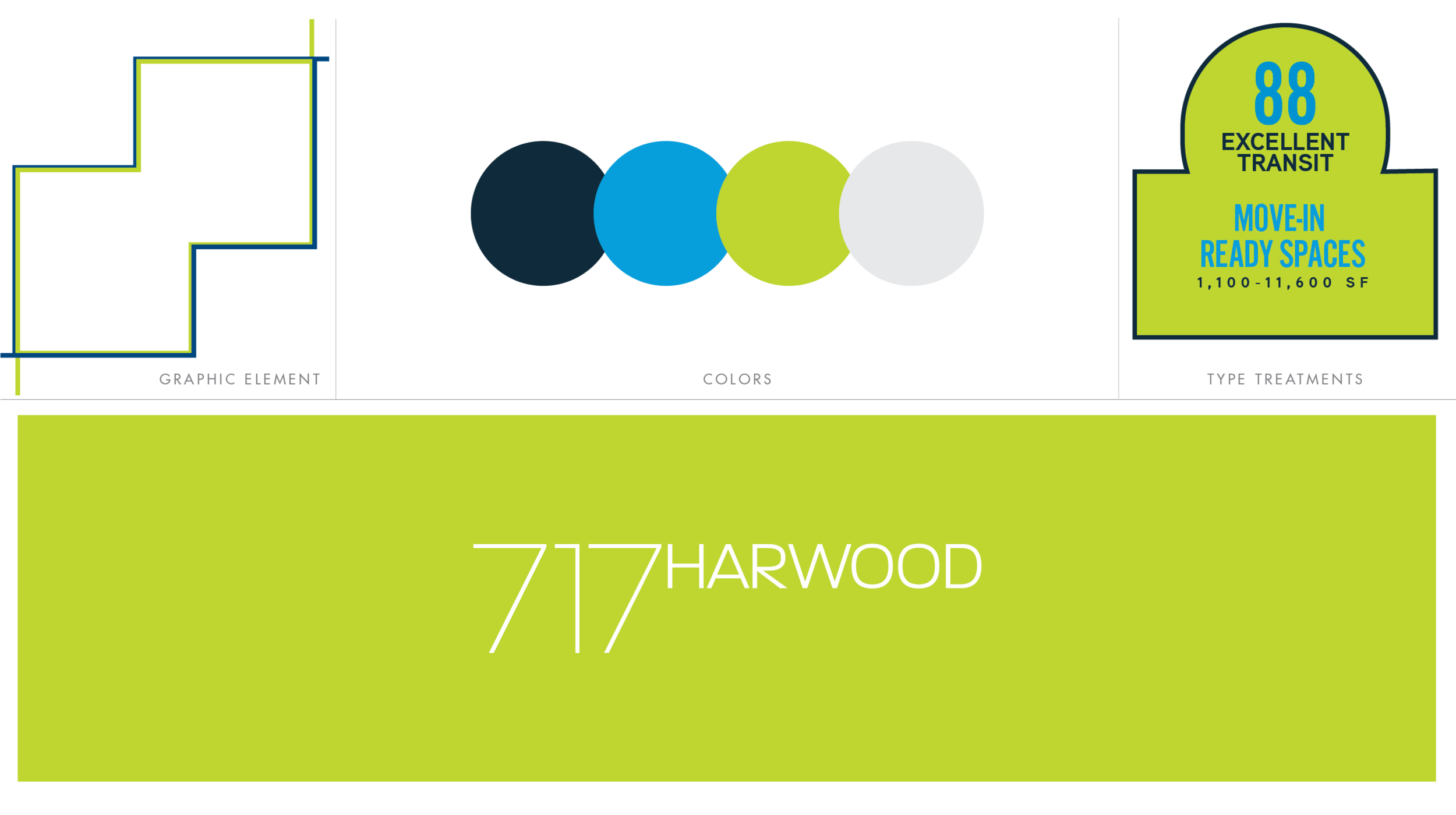
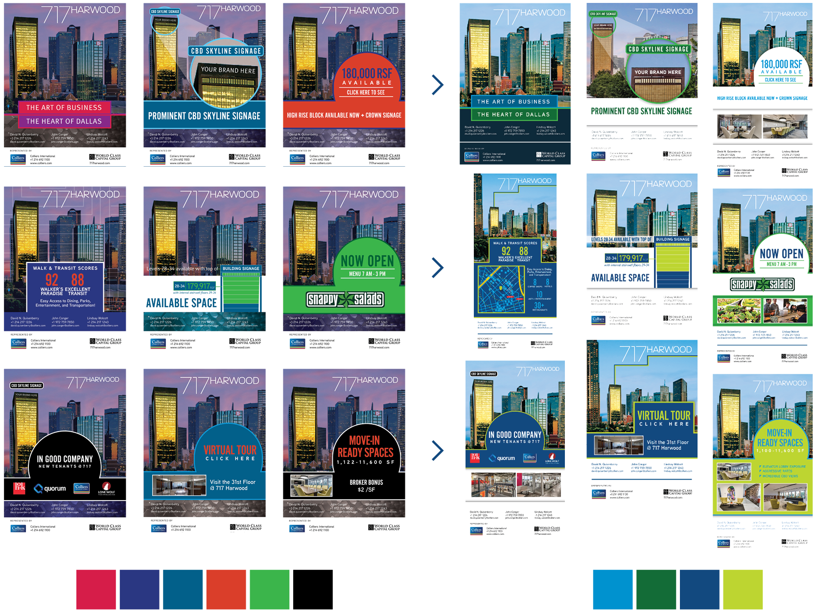
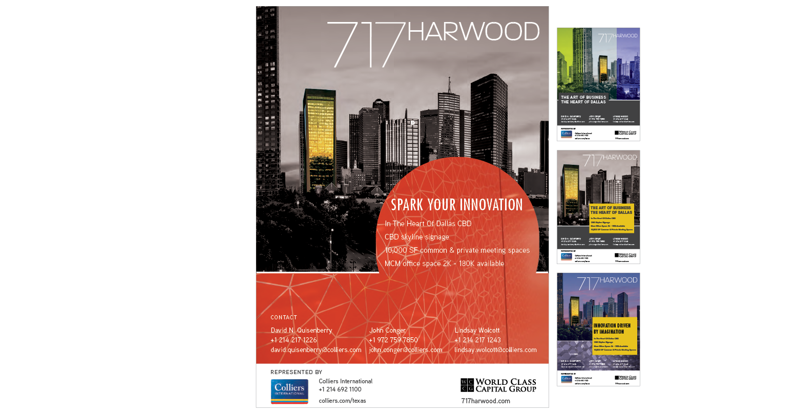
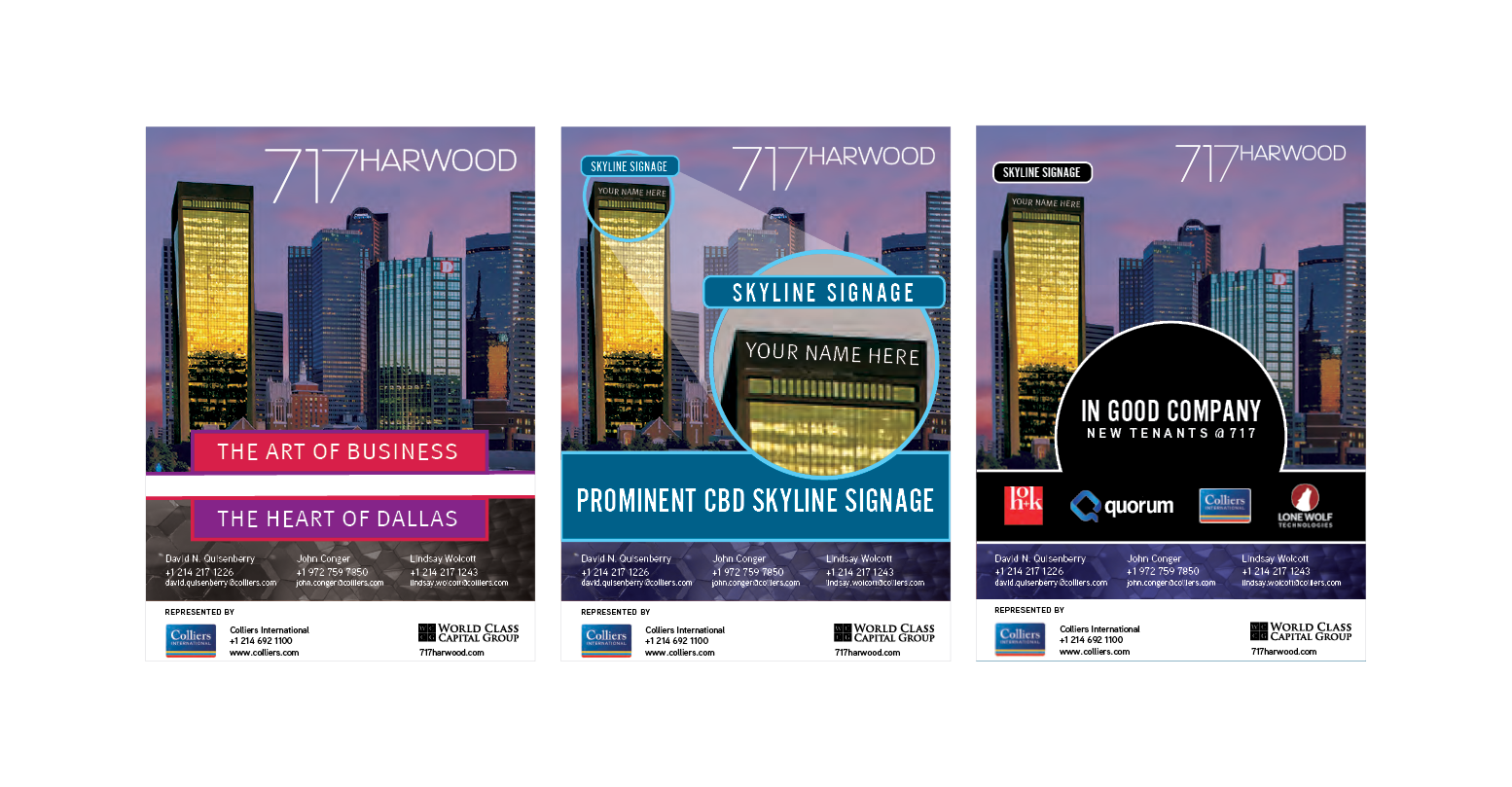
After several rounds of review and collaboration with the owners, we created a vibrant brand identity for 717 Harwood. The final brand and color palette is inspired by our research and a collaborative effort. Sometimes you have to take a step back and examine the whole picture to adjust and make the client happy- this was one of those projects. In the end, I created a vast array of graphic elements that offer a flexible kit for usage when creating promotional materials past this drip campaign. I developed a foundation that the ownership went on to utilize when revitalizing the rest of their marketing materials for the future.